

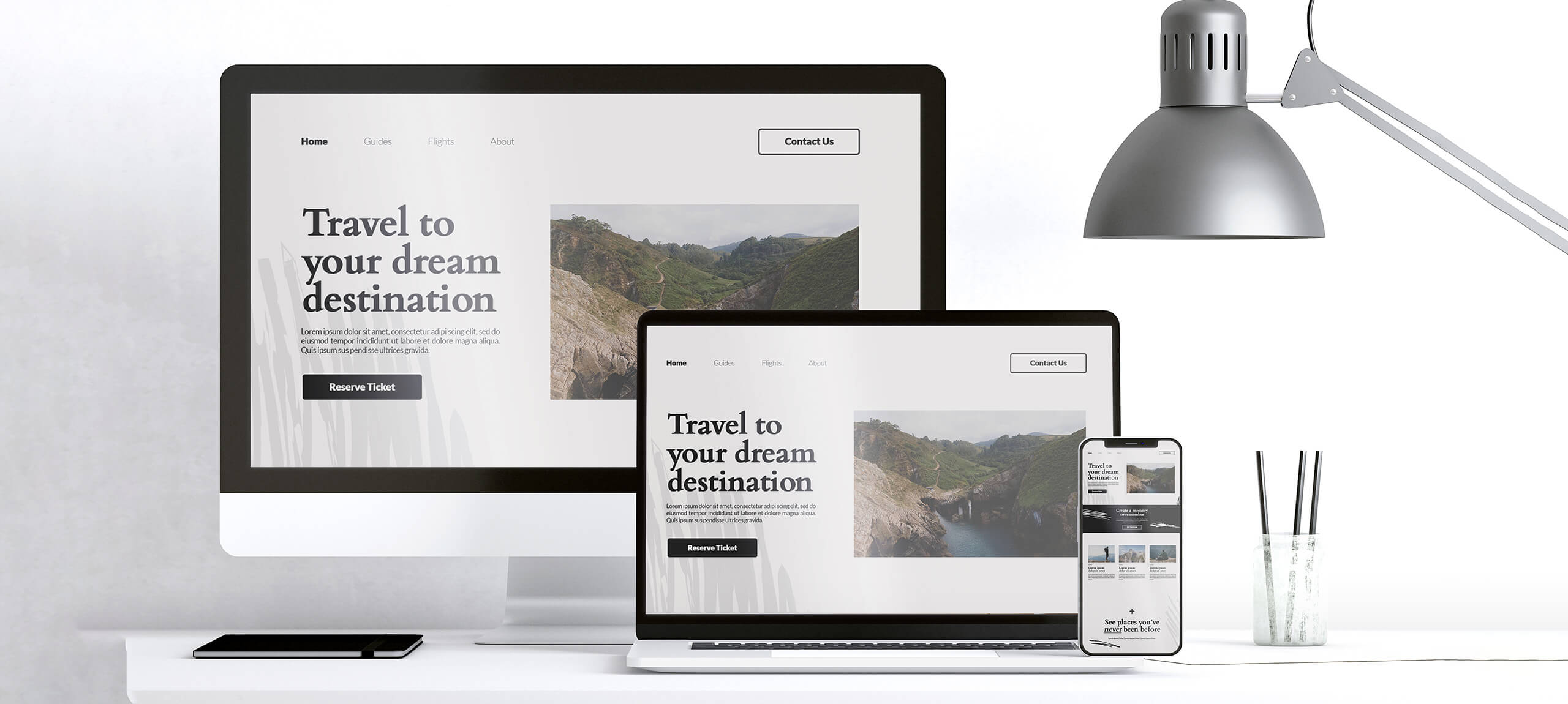
Responsive Design for PrestaShop: Why It Is Essential for E-Commerce
Responsive design in e-commerce does not simply mean shrinking a desktop layout until it fits on a phone. It means the full shopping journey —navigation, search, filters, product page, cart and checkout— remains practical across different screen sizes.
In our PrestaShop e-commerce development, the mobile interface is treated as a real shopping environment rather than a miniature desktop version.
Google uses mobile-first indexing
Google uses the mobile version of content for indexing and ranking. Important content and essential information therefore need to remain available in the mobile experience.
Google recommends responsive web design as a practical approach because the same URL and underlying content can adapt to the user's screen.
Mobile navigation
A desktop mega menu cannot simply be compressed. On mobile, it should be obvious how categories and subcategories open, how users return to the previous level and how they reach search, account and cart quickly.
Catalogue hierarchy needs to remain understandable even when the available screen space is much smaller.
Search that works well on a touch interface
In stores with large catalogues, search may be the fastest route to a product. Search fields, autocomplete and suggestions need to work properly with touch keyboards and should not be hidden by overlays.
Search can also require specialist improvements depending on the catalogue. See our guide to improving PrestaShop search.
Filters and product listings
Filtering is one of the more difficult parts of mobile commerce UX. Filters need to open, apply and clear without causing the user to lose context in the product list.
Product cards also need clear hierarchy so the image, title, price and essential availability information remain understandable without overcrowding the screen.
Product pages and combinations
Products with size, colour or many combinations need selectors designed for touch. Customers should not need to zoom or attempt to activate tiny controls.
For specialist catalogues, custom PrestaShop interfaces can be developed so product selection better matches the actual product structure.
Cart and checkout
Mobile checkout should minimize unnecessary effort. Fields, labels, validation, payment methods and shipping choices need a clear order and enough room for touch interaction.
Sticky elements, cookie notices and popups should not cover critical controls or validation messages.
Responsive design does not automatically make a site fast
A responsive website can be fast or extremely slow. Performance depends on images, scripts, modules, database activity, caching and hosting.
Responsive implementation should therefore be combined with technical performance review, particularly in PrestaShop where many pages are dynamic.
Responsive images and media
Large product imagery should not always be delivered at the same dimensions regardless of the device. Appropriate image sizing, formats and lazy loading where suitable can reduce unnecessary data transfer.
Accessibility on mobile
Responsive and accessible design are related but not identical. Touch-target size, contrast, focus, keyboard behaviour and semantic structure still require separate attention.
For deeper review we provide web accessibility optimization for websites and PrestaShop stores.
Responsive design and SEO
A mobile-friendly interface supports overall technical quality and is important in a mobile-first indexing environment, but responsive design does not guarantee that a page will automatically outrank another page.
Organic performance also depends on search intent, content, crawlability, internal linking, authority and many other factors. These are addressed through our SEO services.
Testing real breakpoints
It is not enough to test one desktop screenshot and one mobile screenshot. Intermediate widths, different aspect ratios and the important customer journeys need testing.
Menus, filters, modal dialogs, product selectors, cart and checkout deserve particular attention because that is where many responsive problems appear.
Responsive implementation is part of the build, not an optional extra
A professional e-commerce store should be designed for multiple devices from the beginning. Responsive behaviour should not be added as an afterthought once a desktop version is complete.
In our PrestaShop projects, catalogue navigation, product pages and checkout are designed with the mobile experience included in the core project requirements.